
summary
mission
Redesign the SPANX® Product Detail Page to modernize its visual design and branding, restructuring the overall layout, information hierarchy, media gallery, and size guide to create a page that felt as premium and considered as the product itself.
my role
I led the design on this project as part of a team of three designers, working in close collaboration with our Product Marketing, Brand partners, Product Managers, and engineers to bring the new PDP and its updated components to life across desktop and mobile.
impact
The redesign brought SPANX®'s PDP up to modern e-commerce standards – clearer product storytelling, easier size and fit decision-making, and a more cohesive visual identity across every product page on the site, all aided by comprehensive qualitative research analyses and impactful A/B testing.
client

E-commerce, engineering, Brand, and Product Marketing teams at SPANX®.

services & skills used
UI&UX Design
Information Architecture
Cross-team collaboration
Visual / Brand Design
Headless Shopify
A brand known for iconic products, in need of an equally iconic page.
SPANX®'s Product Detail Page hadn't kept pace with the brand's evolution – the visual design felt dated next to the product experience customers had come to expect. The goal was to modernize the page from the ground up: overall layout, information hierarchy, media gallery, and size and fit details, while introducing new display sections and components to support product education and boost consumer trust.

The core team, Product Marketing and Digital Product Design, came together with one goal: bring her into the future.
Although elements of the PDP were recognizably modern following a redesign that went hand-in-hand with an early 2025 transition to a Headless Shopify model, there was much left to be desired.
We collaborated for over a year, pouring over ideas, components, and concepts, testing those concepts, and then putting them together to make one final perfect "recipe".
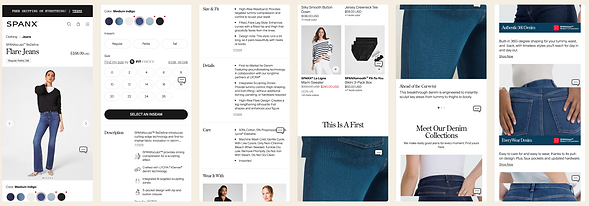
the work
The first order of business was ideate, ideate, ideate.


After an extensive competitor audit, a lot of heads-down design time, and many review sessions, the team came up with a plan: we knew the direction we wanted:
-
More visuals, fewer unnecessary words
-
More emphasis on clarity to not bog her down with details
-
Anything to help make the vertical height be reduced so scroll-depth is optimized).
It was time to test.

I conducted over 70 tests, utilizing both UserTesting and Strella. Through collaboration with my fellow designers, we created several test plans – these ranged from complex to simple, all of which were meant to stress-test what worked, and what didn't.


the impact
After pouring through these test results, talking to real customers, and considering all of the outliers of our proposed components, we had a plan.

A bolder, more effective media gallery
A simpler, clearer hierarchy
Review stars
Modern swatch shape
Size dropdown, taking the place of Size Selector buttons
Product details in a tabbed component
Dedicated section for Product Education
82% of test participants found a bespoke educational section as "justifying [higher] price", "significantly more trustworthy"
New Comparison Table component
Test participants found immediate value, citing special appreciation of comparing Compression
Category-level Cross-Selling Element
Favored unanimously by users on the live site
In the end, we were able to see notable impact, through thoughtful new inclusions like:
-
A cleaner, sleeker, swipeable media gallery
-
A tabbed accordion model to get away from an extremely tall details element
-
The "SPANXeducation Center", which highlighted key product information for the first time with real intention
-
Cross-Selling elements with a real POV
This also meant getting stakeholders on board, so I put together several key presentations and presented them to our Executive Leadership Team, getting buy-in and recognition: this was a labor of love that made her life easier.

in conclusion
Though I have countless more details I could add regarding SPANX's PDP ReDesign project, the primary takeaway was that so much goes into every detail – the smallest tweaks can create the biggest impact, and it was so amazing to hear that directly from loyal customers.
I loved having the chance to see up first how much it meant to make her shopping experience easier, more efficient, and more enjoyable. This collaboration was time-intensive but important, making an impact in ways small and large.